I was standing in a hotel lobby last month, typing out a note about the conversation I had just walked away from, when I stopped to check how the guy spelled his last name. Two taps over to his contact, two taps back, and the note was gone. I stood there trying to rebuild four sentences I had written ninety seconds earlier. I got two of them.
Memglow 1.5.0 is on the App Store today, and a good share of it comes from moments like that one. Capture is faster and much harder to lose. Follow ups say what they actually mean. And there is a fair amount of repair work underneath that you will notice mostly by not noticing it.
Finding someone takes a second now
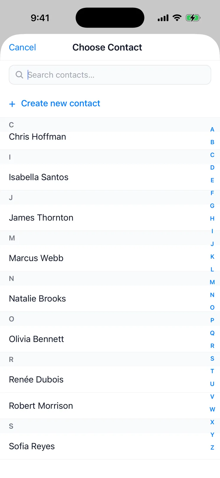
The contact picker used to assume you knew roughly where your people sat in a long alphabetical list. It now opens with a search field at the top and an A to Z rail down the side, so you can type or thumb straight to the letter, whichever your hand reaches for first.
Search also got smarter about the way names actually get typed. It matches on part of a name, so "johnso" pulls up Johnson before you finish the word. And it ignores accents, which turned out to matter more than I expected: "renee" finds Renée, whether or not you know where the accent goes or feel like hunting for it on the keyboard. You should not have to spell someone perfectly to find them.
Add Memory, wherever you already are
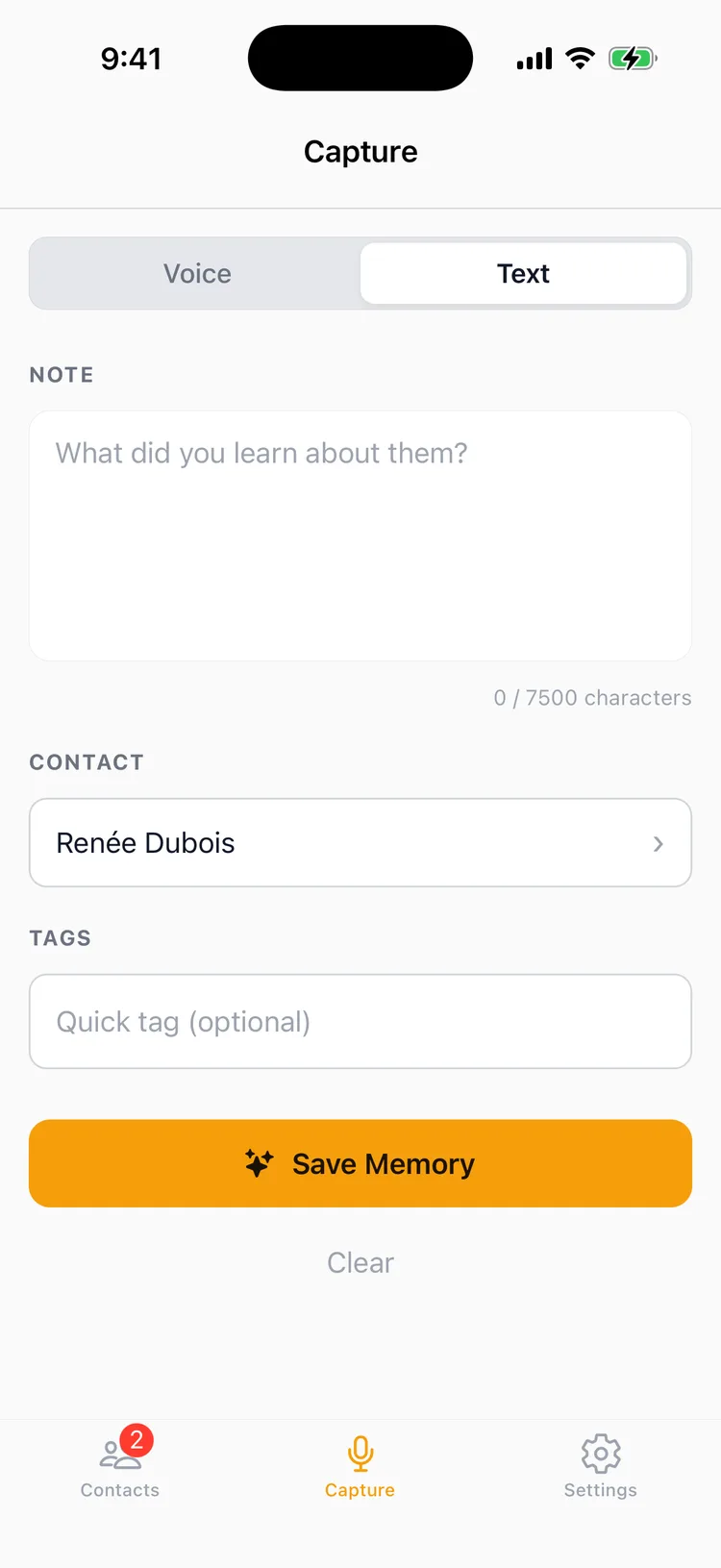
Add Memory now lives in the contact header, and it is there on every tab. You could be reading someone's facts, their timeline, or their follow ups, and the second you remember something worth keeping, the button is right at the top of the screen. No backing out to Capture and picking the person over again.
The other half of that is the part I care about most. Drafts survive. Start a note, switch tabs to look something up, come back, and your text is sitting exactly where you left it. The sidewalk moment doesn't happen anymore.
Follow ups that say what they mean
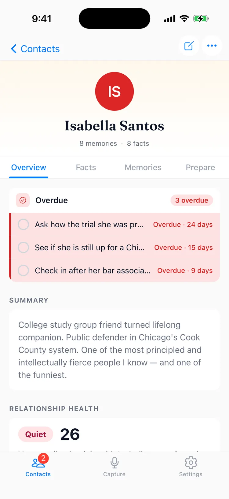
The urgent card used to hand you a stack of follow ups without telling you what kind of stack it was. Now it says so in the header: Overdue, Due Soon, or both. You know whether you are behind or merely about to be before you read a single name.
The count is honest too. It tallies everything overdue, not only the rows that fit in the card. If eleven things are late and three are showing, it tells you eleven.
A digest with the detail
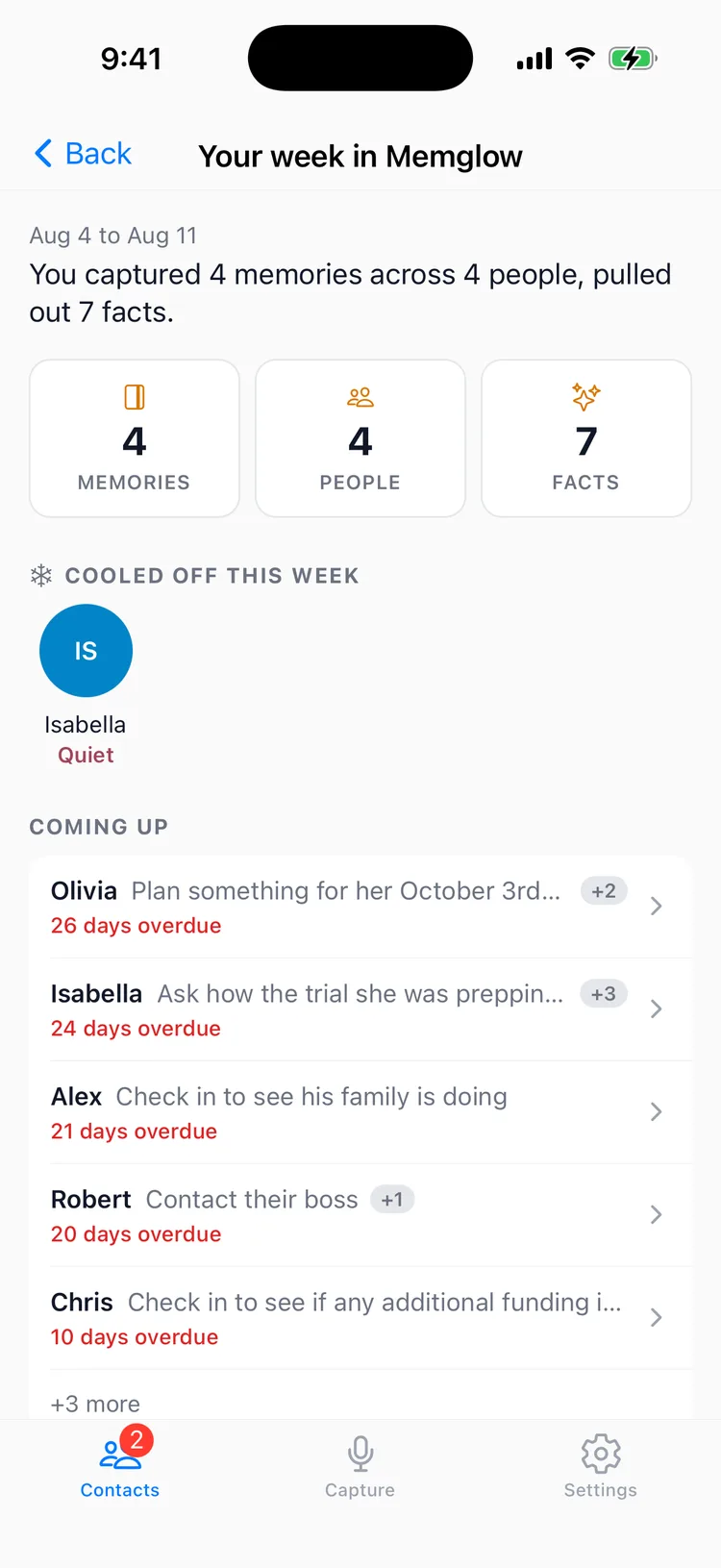
Coming Up, on the digest screen in the app, used to be a list of names. Each person now carries the actual follow up and the date it is due, so you can read the section and know what you owe people instead of guessing at it. More of them surface, too, with a count at the bottom for everyone who did not fit.
The digest email has a simpler job and it does that job better. Tap Open in Memglow and you land on the Digest screen itself, one tap, no wandering through tabs to find the thing the email was pointing at.
Clearer plans
A few changes to make the money part less murky. The paywall knows the plan you are already on, so it reflects that rather than selling you something you own. Settings always keeps a visible route to your plan options, so checking what a tier includes is never a scavenger hunt. And Pro features carry a Pro label before you tap in, instead of announcing themselves once you are already halfway into something.
The rest is under the hood: reliability work on capture, on app launch, and on subscriptions, plus a run of small bug fixes. All of it is why the app should feel steadier this week than last. Update on the App Store, and tell me what still gets in your way: support@memglow.ai. The note you started is still there when you get back.